New front-page design proposal.
Hi,
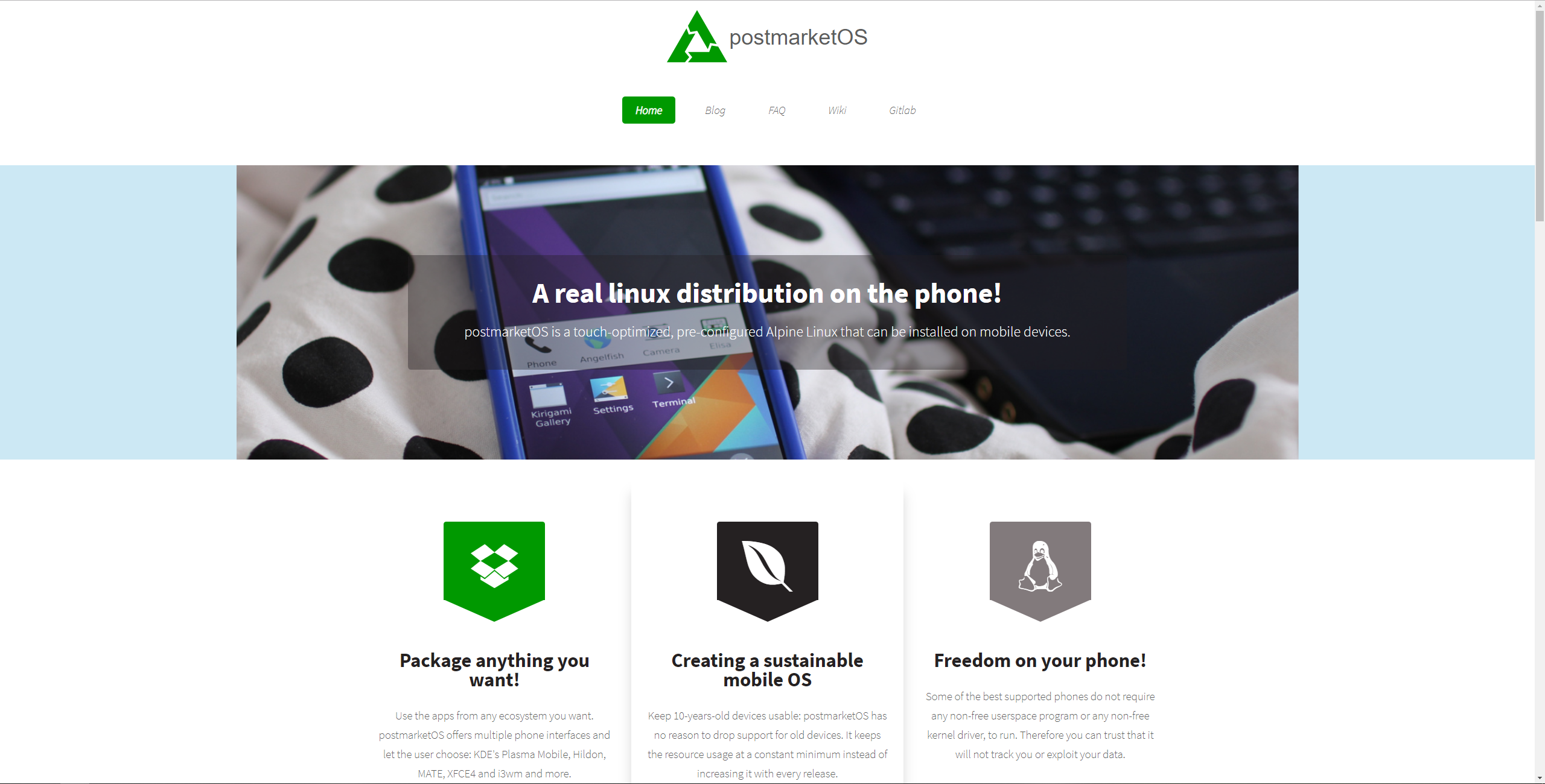
As promised I made a quick front page design for postmarketos.org .
Demo here: https://www.own-mailbox.com/postmarketos.org/index.html
code here: https://gitlab.com/pparent/postmarketos.org
It is based on this theme which is under creative commons by: https://html5up.net/dopetrope
Feel free to use it! It's almost usable as such with very minor modifications.
Hope you like it, and I hope it could attract more people to test and or develop on the project.
Activity

I like most parts of the design. I think a lot in this design can be used with changes. Like the light blue background behind the header looks better if it uses the current grey (#eee) instead. I also dislike the text thats thrown over the header image, that could be integrated better.
One of the design restrictions we worked with with the current design is using no javascript and webfonts at all. Mostly because the web is bloated enough already. But also because the website wouldn't trigger noscript.
If you compare the page weight between the versions:
281 KB -> 815 KB (290%) 9 requests -> 26 requests 150 ms to interactive -> 280 ms to interactive (this gets way worse on 3G with 2.71 -> 4.496 seconds)
Its probably possible to optimze the design so it uses around the same amount of resources as the current page.
By Martijn Braam on 2018-10-12T21:32:49
-
Like the light blue background behind the header looks better if it uses the current >grey (#eee) instead
There should be a photo there.
One of the design restrictions we worked with with the current design is using no >javascript and webfonts at all. Mostly because the web is bloated enough already. But >also because the website wouldn't trigger noscript.
Javascript is actually useless on this page: I removed it.
No idea about webfonts, and page size. Quite franckly it's quite far from my concerns. But I let you modify this to make something that you like.
Also I wanted to mention that the current website has display ratio issues on older firefox version. I will make a screenshot on my work's computer on monday.
Thank's!
By Pierre Parent on 2018-10-12T21:48:23
-
I noticed that the current design has some issues with the scale of the images being wrong. Looks like your page uses javascript to create the interactive mobile menu on phone browsers. which the current website just solves by not stuffing a lot of menuitems in there. that probably also works in your page without js.
The blue is probably because the template you used doesn't scale above 1080p screens. This is what it looks like on a 2.7k screen:
By Martijn Braam on 2018-10-12T21:58:19
-
Ok I see both problem are solvable (js + image size). I will do that on monday or Wednesday, if none does that before.
By Pierre Parent on 2018-10-12T22:08:53
Edited by Administrator -
Thank's for your remarks. I'll correct this in few days.
I don't know if there are nonfree kernel drivers
What do you mean? In general? Non-free external kernel modules do exist. The last example I saw was mediatek wifi proprietary drivers for openwrt. There is of course the well-know Nvidia proprietary module. But there exist probably many more.
http://nossiac.com/download/mtk-wifi-ko/
https://forum.openwrt.org/t/mt76-precompiled-drivers-mediatek-wifi-is-useless-in-mt7628/8138/18
By Pierre Parent on 2018-10-13T07:14:45
Edited by Administrator -
Oh, I wish I had not written "merge request welcome" when you asked about designing a homepage. But instead: "what would you like to improve with the current homepage?". But you obviously put a lot of effort into the new one, so here goes my review.
Less standing out
The current homepage stands out because it is not based on a template that is used many times around the web already (be it the exact theme, or similar ones). I think this is a feature, and I would rather not go for making it look more like other pages.
Using stock photos contributes to that effect. We have so many photos in the wiki of devices running postmarketOS, I don't think that we need to use stock photos at all.
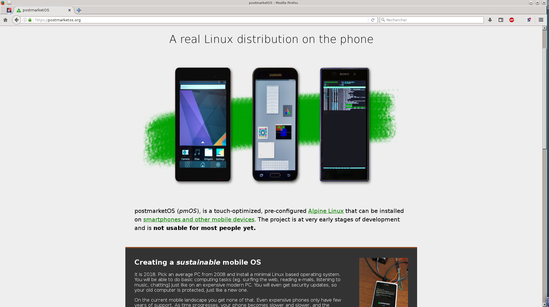
Especially we should not use icons that are other companies logos. There are the dropbox and envira logos used right below the header. And similar to the stock logo, sure, we could use a tux icon to indicate that this runs real Linux. But I think it sends a much stronger message to have a photo of a phone running something like htop in full screen.
"Test it now!" section
postmarketOS is not stable enough to be tested by the average user, and the headline of that section is kind of inviting them to do just that.
There is the orange warning text, but the orange feels out of place compared to the other colors, so users may not read it because of that. Imho this is better solved in the current design, where we have the "early stages" text as second sentence the user will read, right at the top.
The devices displayed there may have many "Y" in the devices overview, but that does not mean that they really run that great. I think before we present specific devices, where postmarketOS runs especially great on, we should have people who are really using it on that device every other day, so we are aware of how well it works and when we have regressions. I know that you are actually doing that on the Nexus 5, and I think this is incredibly valuable for postmarketOS. But the "Teclast X80 Pro" was a one time port, and then the maintainer disappeared basically. Opendata's Z2 Tablet is broken, so we don't get new data on that anymore. And I doubt that the Nokia N9 is used much with postmarketOS either.
The Sony Xperia Z2 tablet photo does not even run postmarketOS, I think this is a stock photo from somewhere else. I'd advise highly against using that. While the Nexus 5 photo you took is pretty good, some of the other device photos are blurry, weirdly rotated and/or cut off.
The text below the phones are not adding anything useful besides stating the obvious "The embeeded keyboard experience.", "A modern smartphone experience!", "Another modern smartphone working well.". In my opinion, this is the downside of using a theme - when using a certain section that expects to have text there, but just inserting a filler so it can be used. The same goes for the "Find out more" button - one could as well just add a link to the device's name.
Other
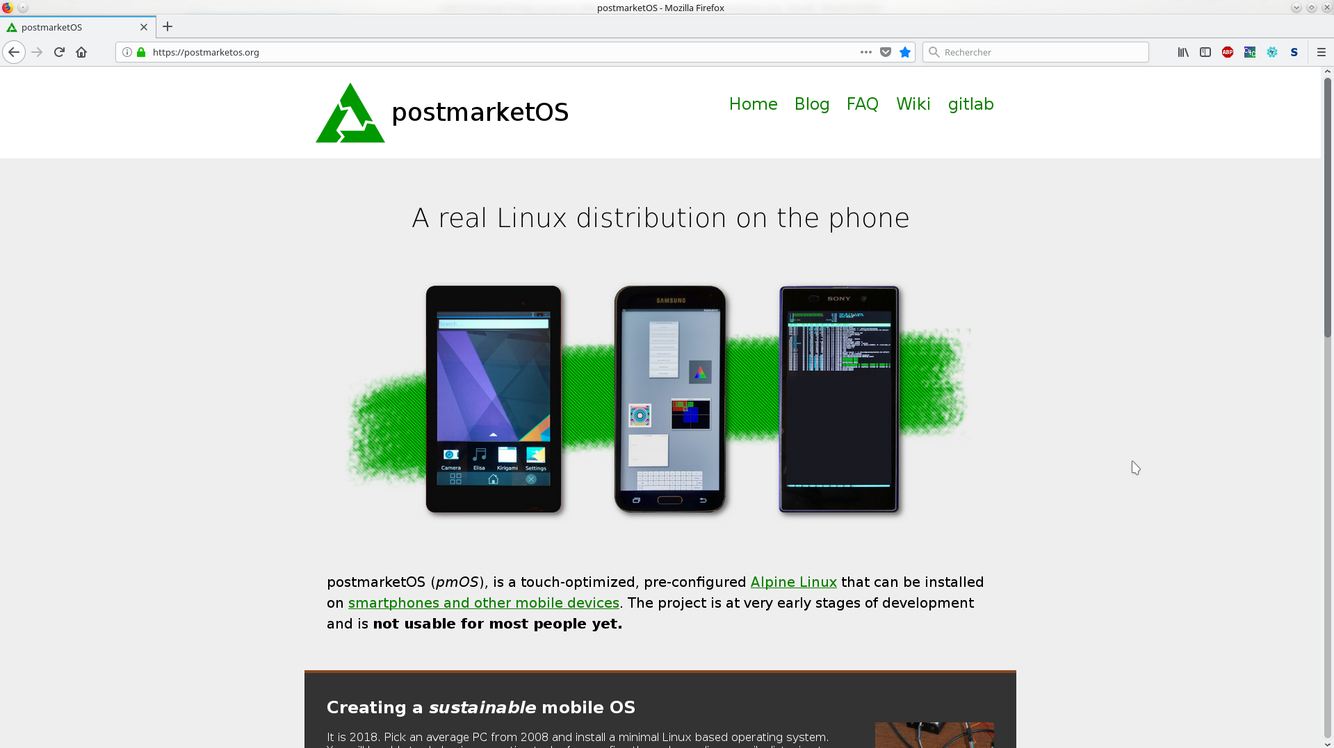
I noticed that the current design has some issues with the scale of the images being wrong.
True, and this is solved much better with @pparent's homepage.
I hate writing such reviews, where I don't have much positve to say, because it is obvious how much energy you put into this. I highly appreciate all the work you have put into postmarketOS and I'm sad to say that I'd rather have the current homepage modified with what you are missing (what are these things?) and especially fixing up the mobile view. Again, this is what I should have recommended in the beginning, instead of just saying please make a merge request. My apologies for that, I'll learn my lesson from it

EDIT: we can also talk in matrix/IRC about this if you like to, I'm online right now.
By Oliver Smith on 2018-10-15T05:31:50
Edited by Administrator -
Ok it does not matter if you don't want to use it. I did not put that much effort into, was pretty much filling an existing template.
Just wanted to say:
-I'm all for warning people that it's in development and not yet very usable. But if you don't want to tell hackers that they can test it, then you won't have any new developers, and then it does not get usable fast. You could very well never have seen me here, because I almost did not go any further, than the front page thinking I could not test it or run it at all, or make anything interesting out of it. After my videos on my youtube channel I got questions asking me if and how it was testable.
-From my experience on creating websites on the internet to sell things, and having had feedback from many people with my sites, they really don't care if it uses an existing template or not (instead it can be reassuring). They care about having a beautiful site and understanding as fast as possible what the project or product could bring them.
-I talked about pmOS with few friends. Most of them told made very negative remarks when seeing the website, on contrary for example to the plasma-mobile website (https://www.plasma-mobile.org/), which is no less experimental and which has nevertheless a "getting plasma-mobile" section.
In conclusion I'm pretty sure that the current website is a big obstacle to the development of the postmarketOS. The one that I proposed is clearly not the best we could do, but is in my mind a clear improvement over the existing. But of course you are free to think differently, and I won't I won't blame you, as this is your project.
Ps: I agree that the dropbox and envia logo could not have been used as such. But they could have been replaced by equivalent icons such as: https://fontawesome.com/icons/box?style=solid
By Pierre Parent on 2018-10-15T08:04:28
Edited by Administrator -
Thanks for this important feedback! I need to go, but I'll answer this
tomorrowthe day after tomorrow (something came up, sorry).By Oliver Smith on 2018-10-16T11:54:25
Edited by Administrator -
Also just wanted to add a last remark:
To me the photos on the template I proposed were clearly "to be improved" (I took quickly the first photos I found on the wiki). I find that there are very few appealing photos on the wiki. Even the ones that I did my self are not satisfying, and I could do better ones, if I knew they were to be used on the front site (but I don't have all the devices).
Also when a photo with a console or westo-demo is put on front page, in my mind, it sub-communicates that the project won't bring you or focus on bringing you a real touch-optimized experience.
By Pierre Parent on 2018-10-15T08:17:54
-
@z3ntu wrote:
And GitLab is capitalized
It seems like they changed their spelling from gitlab to GitLab (see the top left of gitlab.com).
@pparent wrote (the following quotes are all from you):
Here is the screenshot of what I get on the firefox at my work (debian 8.0)
This is how the current version is supposed to look like.
They care about having a beautiful site and understanding as fast as possible what the project or product could bring them.
This would be my goal as well.
You could very well never have seen me here, because I almost did not go any further, than the front page thinking I could not test it or run it at all, or make anything interesting out of it.
Fair point. How about we add a new panel below "Evaluating options for security holes in firmware" (speaking of the current design), with something like that as content:
~100 booting devices
We already have lots of booting devices with various grades of functionality. If you are up for some fun hacking time, find yours in the device list and read the installation instructions to get started. For missing devices, see the step by step porting guide.
I talked about pmOS with few friends. Most of them told made very negative remarks when seeing the website
Were the remarks about not having a "try it out" or similar section, or about something else?
I find that there are very few appealing photos on the wiki. Even the ones that I did my self are not satisfying, and I could do better ones, if I knew they were to be used on the front site (but I don't have all the devices).
Would you like to make one awesome photo of the Nexus 5 running Plasma Mobile with the grass wallpaper, which could then replace the current banner?
It would be nice if we could display multiple mobile UIs up there, maybe we can add more Nexus 5 photos once we have ubports and/or phosh working.
(Maybe we can fit the green tone from the logo in there somehow?)
Also when a photo with a console or westo-demo is put on front page, in my mind, it sub-communicates that the project won't bring you or focus on bringing you a real touch-optimized experience.
The idea was originally to show that there are multiple UIs to choose from, and that you can open up a terminal like on a typical Linux computer. But I can see how this is misleading, it would be nicer to show multiple touch UIs there. Maybe we make that the goal and go with one UI in the meantime, until we have ubports and phosh working as well.
By Oliver Smith on 2018-10-17T05:27:43
-
This is how the current version is supposed to look like.
And yet when I look a the website with Firefox 62 the image ration is different (and looks better)! I can make another screenshot to compare with if you want.
Were the remarks about not having a "try it out" or similar section
->One has seen it on mobile, and apparently no photo at all appear in mobile version, only text, which he just did not want to read at all. (I did not try it myself)
->Two others simply told me more or less that the website design was poor, and that it would probably be reflective of the user experience this project could give. But I did not have much more details.
Would you like to make one awesome photo of the Nexus 5
Yes no problem I can do many of them with Nexus 5 (some "artistic" in context, and some on a white background). I can make some with the wallpaper you asked and some with a web-browser or other app opened. Then we have a collection, and we can use them later whenever needed.
I have a N900, I could in theory do photos with it as well, but it does not work with pmos (graphical interface freeze). I will give away the device if someone here is interested.
~100 booting devices
It would indeed improve the situation.
Another important info that is lacking according to me: postmarketOS is the first distribution ever giving a usable mobile experience without proprietary software (except external firmware). This info is major because it can attract many people (including me).
The current homepage stands out because it is not based on a template
Also just wanted to say that in few years of designing web interfaces for embedded devices, and "landing-page" websites, for professional purposes; I came to the conclusion that in term of web-design reinventing the wheel is almost always a bad idea expect if you have very skilled web-disgners and/or you have a lot of budget.
Using templates:
-Allows to save a lot of time.
-Ensures a certain base/standard in term of "beauty".
-Reduces non-anticipated sides-effects on non-tested browsers/devices (like photo display ratio, or no photo on mobile).
By Pierre Parent on 2018-10-17T09:40:55
Edited by Administrator -
The current homepage stands out because it is not based on a template that is used many times around the web already (be it the exact theme, or similar ones). I think this is a feature, and I would rather not go for making it look more like other pages.
I agree with that too.
By Luca Weiss on 2018-10-17T08:08:51
-
If usefull here is the screenshot on firefox 62 (to be compared with the one upper):
By Pierre Parent on 2018-10-17T08:18:03
Edited by Administrator -
You may download it here: https://ftp.mozilla.org/pub/firefox/releases/45.8.0esr/linux-x86_64/fr/
height: auto;does not change anything.By Pierre Parent on 2018-10-17T10:58:27
mentioned in issue #87 (closed)
By Oliver Smith on 2018-10-21T17:25:10
-
This is how the current version is supposed to look like.
And yet when I look a the website with Firefox 62 the image ration is different (and looks better)! I can make another screenshot to compare with if you want.
Now I get what you mean... you're right of course, the first one has a weird image ratio it should not have. Mentioned that in #87 (closed) (let's keep the discussion there for everything about images being displayed wrong?).
Would you like to make one awesome photo of the Nexus 5
Yes no problem I can do many of them with Nexus 5 (some "artistic" in context, and some on a white background). I can make some with the wallpaper you asked and some with a web-browser or other app opened. Then we have a collection, and we can use them later whenever needed.
This would be great!
Another important info that is lacking according to me: postmarketOS is the first distribution ever giving a usable mobile experience without proprietary software (except external firmware). This info is major because it can attract many people (including me).
Yeah, we could mention that it is optional in postmarketOS. In order to get pmOS as a whole out of the proof-of-concept stage, it does probably make sense to run some devices with libhybris for now (see #83 (closed)). When postmarketOS is more stable, of course devices that do not need libhybris like the Nexus 5 will have a great benefit from that as well (and ideally we'll get more devices mainlined in the long run).
Also just wanted to say that in few years of designing web interfaces for embedded devices, and "landing-page" websites, for professional purposes; I came to the conclusion that in term of web-design reinventing the wheel is almost always a bad idea expect if you have very skilled web-disgners and/or you have a lot of budget.
Using templates:
-Allows to save a lot of time.
-Ensures a certain base/standard in term of "beauty".
This can backfire when the template does not match the content it is filled with (e.g. colors).
-Reduces non-anticipated sides-effects on non-tested browsers/devices (like photo display ratio, or no photo on mobile).
That make sense, but I would still argue that it is a matter of taste. postmarketOS is for hackers right now, so the homepage should invite hackers, have the design built around the content and not the content made to fit an existing design. When we are ready to invite non-developers to test postmarketOS, then that is a different story.
By Oliver Smith on 2018-10-21T17:49:45